Role
- Student Project
Tools
- Illustrator
- After Effects
- Adobe Media Encoder
Deliverables
- Redesign of Home and About Pages of the Phoenix Public Library Website based on user testing
- High fidelity wireframes of redesigns for desktop and mobile
- Animated demonstration of mobile wireframe
Project Overview
This project was designed to take us through the entire UX study and redesign process. We started by designing and then performing user tests for an existing website design. I chose the Phoenix Public Library website. We then chose two webpages that our user tests identified as especially problematic and redesigned them. Finally, we created high fidelity wireframes of our redesigns.
User Testing
I first wrote a pretest questionnaire identifying participant’s relevant levels of experience with their local library and its web presence, as well as key demographic information.
After they finished their questionnaires, I directed test participants through a variety of common tasks on the library website: renewing a library card, finding a relevant program in the next month for a specific age group, putting a specific book on hold, etc. As they completed the tasks, I instructed them to narrate their thought processes and experiences.
I recorded these sessions and compared them, finding the most common pain points with the existing designs. I then decided on two pages: the home page and the about page that were most in need of a redesign.
Home Page Redesign
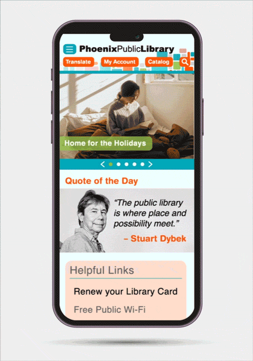
My watchword for my redesign of the homepage was simplify. The complaint I received over and over again from the users I tested was that the homepage had too much going on. It confused and frustrated them.
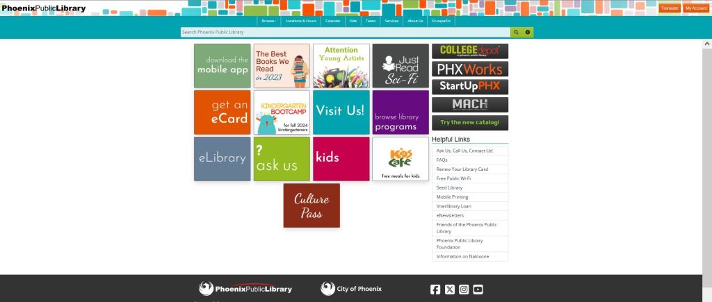
Important information was in too many places: The main nav buttons hidden up in the header image, the helpful links nav below the fold on many screens, and even some vital links which were scattered among the content tiles that dominated the page.
Moreover, one extremely vital piece of information, how to get to the catalog, was completely missing. Even using the links in the “Browse” heading of the main nav, there is no way to access the library catalog from the home page in a single click. Nearly every single one of our testers complained about this.
Finally, a couple testers noted that the home screen felt sort of characterless. Apart from links there was no text at all, and certainly none welcoming a new user to the site. Its aspect was overall one of extreme intimidation.
My redesign seeks to rectify these issues.
Main Nav & Helpful Links
First, I added a widget to the main nav that allows a user to search the catalog (the widget is too large and cumbersome for mobile, where it is replaced with a dedicated button to access the catalog). I then took the buttons which were hidden in the header image and also moved those to the main nav (I kept them where they were on mobile as they are much easier to spot on that version of the site).
Next, I removed the links from the main nav that could be found on the Services page, since according to information hierarchy theory, only top level categories should be present on a main nav. I replaced them with links from elsewhere on the home page that had fit the criteria for being overarching categories according to my card sort.
Finally, I moved the Helpful Links navigation above the advertisements in the side bar so that it will always be above the fold for users, preventing them from missing it at first glance. I also gave it a colored background to make it easier to spot, as several users had overlooked it during testing.
Main Content
I replaced the visually overwhelming and distracting tiles with a scroll bar that allows users to look through links to recent and relevant content. This bar is a home for all content from the tiled section of the original site which was not important enough in the information hierarchy to be moved to one of the navs.
This change is both visually less overwhelming, allows the use of larger images that ground the site and make its content more inviting, and finally is easier to update and fill with current and relevant content (as opposed to the old and dead links now littering so many of the tiled menu pages on the current site).
Finally, I wanted to add a figurative ‘Welcome Sign’ to make the users feel at home. The lack of such text had been noted by several testers. After some research on the library websites of various other big cities, I decided that a literary quote about libraries with an accompanying author picture was something that fit with the mission of the library and gave the whole site a much homier feel.
Fonts, Colors, & Style
I kept the fonts, colors, and stylings of the site as similar to the original as possible, with one major change: consistency. Whereas the current site often breaks its own internal styles, I kept the same font family throughout (professional, modern, but slightly august sans serif), used only colors present in the header image, and made sure that all shapes on the site were consistent with each other for the sake of visual simplicity.
About Us Page Redesign
Testers again and again commented that the About Us page looked unfinished and had worthless content (if you can call a single sentence content). It seemed ludicrous to me that this obviously filler page had been allowed to make it to the main site when so many other library sites I looked at over the course of my research had such detailed and helpful mission statements.
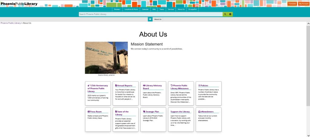
And so I went digging. It appears to be impossible to find a coherent mission statement anywhere on the current site, not even hidden in some sub-page.
However…
The City of Phoenix has a government website which lists mission statements for many of its core programs. And if you look under the library section of that site, you find a complete mission statement for the Phoenix Public Library including helpful links throughout the text and an explanation of many core library policies.
I took this mission statement and reproduced it on my redesign of the site’s About Us page. Now this page actually fulfills the vital purpose of a narrative explanation of the company and what it does that many new users will be looking for.
Mobile Redesign & Mockup
To illustrate the mobile versions of my pages for a potential client presentation, I created an animation of navigating through the redesign in Adobe After Effects and exported it as a GIF using Adobe Media Encoder.
Reflections & Takeaways
Refining an existing design is a whole different ballgame than coming up with your own. The process of walking through a user test was enlightening. It really hit home the axiom: “You are not your user.”
While the users had some problems that I had identified before hand as potential pain points, most of what they said I never could have predicted.
Building my redesign based on the test results was a rewarding experience. I felt like I had a clear roadmap to improving the site that didn’t rely solely on my own creativity and design sensibilities but rather on tried and tested data.
 paul stanton