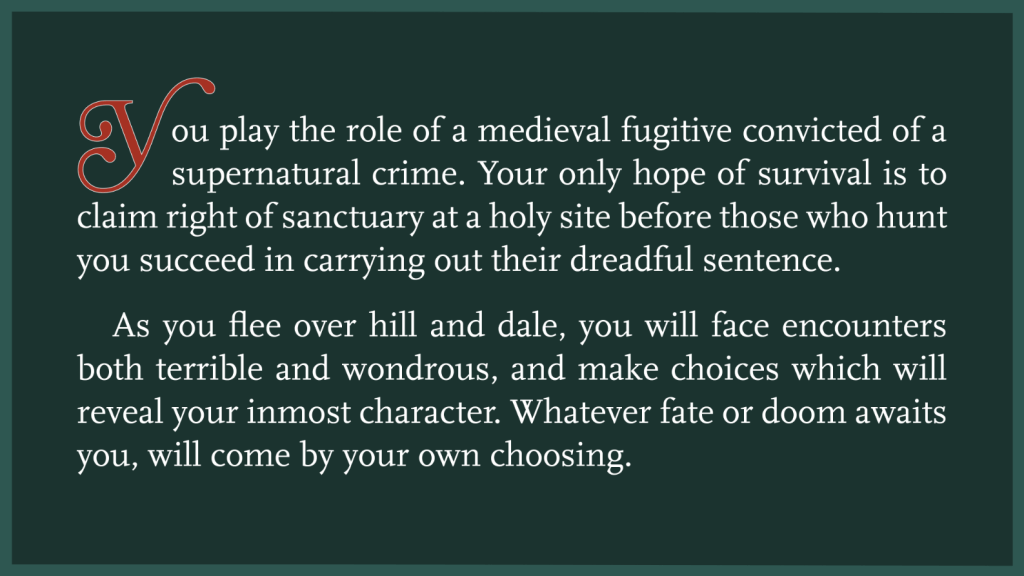
A single-player role-playing game in zine format
Role
- Senior Project
Tools
- InDesign
- Illustrator
- Photoshop
Deliverables
- 28 page, 8.5″ x 5.5″ magazine with impactful choices and four endings
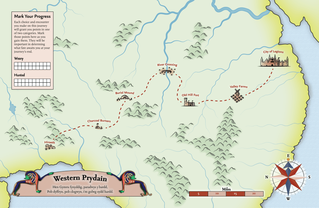
- 11″x17″ map poster that tracks in-game progress
- 6, 8.5″ x 5.5″ event and character cards that effect gameplay
Project Overview
Timeline: 15 weeks
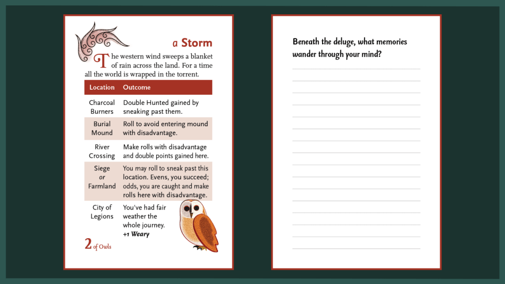
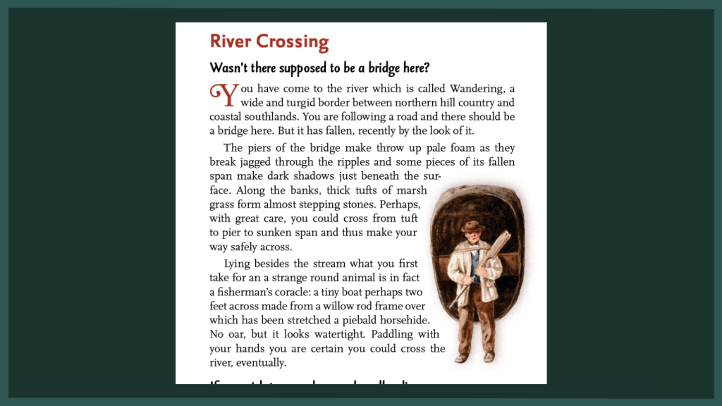
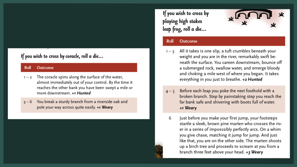
Each spread of my narrative magazine presents a new location on a fantastic journey and offers you (the player) several choices of action. The outcome of whichever action you choose is determined by the roll of a die. You track your progress and outcomes on the included map. In between locations, random events and chance encounters with other travelers can give you new tools to face future challenges.
At the end of the magazine, the choices you made throughout the story determines which of four endings to the journey you arrive at.
Deliverables
Style & Icons
I wanted there to be a touch of the genuinely medieval about the design of my magazine. So I went looking for appropriate references.
The setting of the game is 4th century Wales, but specifically as the period is imagined in High Medieval (11th – 14th Century) Welsh fantasy literature such as the Mabinogion or early Arthuriana. Therefore, I used High Medieval reference sources for all my visuals.
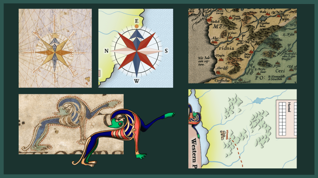
For example: the geography and color scheme of my map is drawn from Humphrey Llwyd’s Cambriae Typus (1573). It’s compass rose copies the design of the first compass rose we have record of, from Abraham Cresques’ Catalan Atlas (1375).
The stylized hounds that frame the map’s title are based on margin illustrations from the Book of Kells (9th Century), one of the most complete examples we have of the Insular Art Style that characterizes art from Medieval Britain and Ireland.
I decided to use my illustrations of the Kell’s hounds to depict the Cŵn Annwn, or Hounds of Unland, who are the magazine’s principal antagonists.
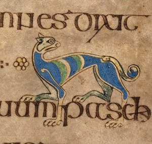
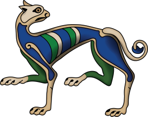
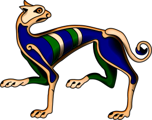
To make these illustrations, I isolated drawings from the public domain scans of the Book of Kells offered by Trinity College Dublin. I recreated these images to the best of my ability in Illustrator. Finally, I ran my illustration through a series of Photoshop filters to add dynamic highlights and a handmade, aged appearance to the illustration.
Icons
I needed to create two sets of icons for my project. The first and largest set would appear on both the map to mark various locations visited by the player and on those location’s corresponding spread in the magazine. For these I was inspired by the Cambriae Typus’ depiction of cities as a simplified skyline with a red highlight behind it.
The second icon set was the two suit icons for my deck of random event/character cards. These were taken from the owl/flower symbolism representing the dual nature of Blodeuwedd, a character from the fourth branch of the Mabinogi whose iconography is woven throughout the story.
Other Images
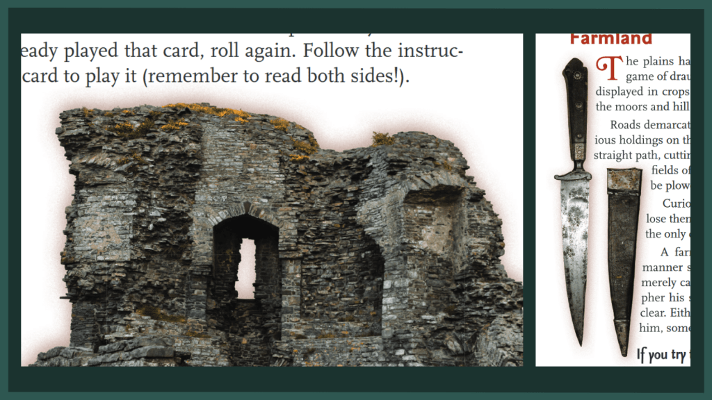
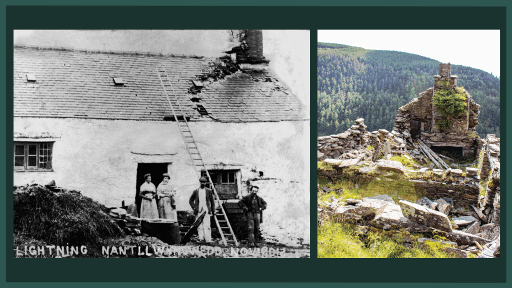
The photographic images in the rest of the magazine are drawn from the public domain or from family photos of Welsh ruins. To keep the images stylistically similar I drew inspiration from the classic DK Children’s Encyclopedia and Our World in Pictures series that use cut-out photos, sometimes with added shadows. My drop shadows are in the same red highlight color as my page titles and highlights.
Layout & Typography
The goal of my layout was to have a straightforward information hierarchy consistent throughout the entire product that made it clear without excess explanation how the game was meant to be played.
The layout’s inspiration was primarily drawn from Classic and Old School Revival Tabletop Role-playing Games.
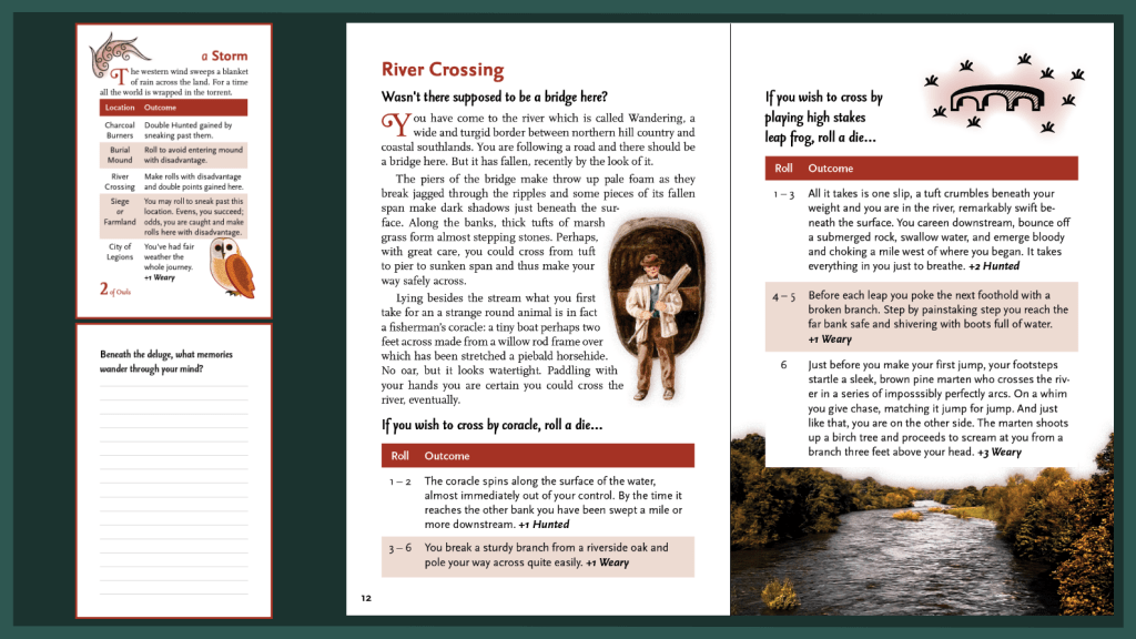
Above is a typical example of play. The player turns to a new spread and draws a card. They follow the prompts on the card, and then play through the location.
Each location starts with narrative text and then presents 1 – 3 choices of actions each subheaded by an “If…” statement. Actions are styled as tables with different results based on the roll of a die.
Typography
I fell in love with the verticality created by the long ascenders and descenders of the Seria font family. And when I found out Martin Majoor had based Seria on the older font family Scala, which omitted those ascenders and was thus usable as body text, I knew I had the typographic identity of my magazine.
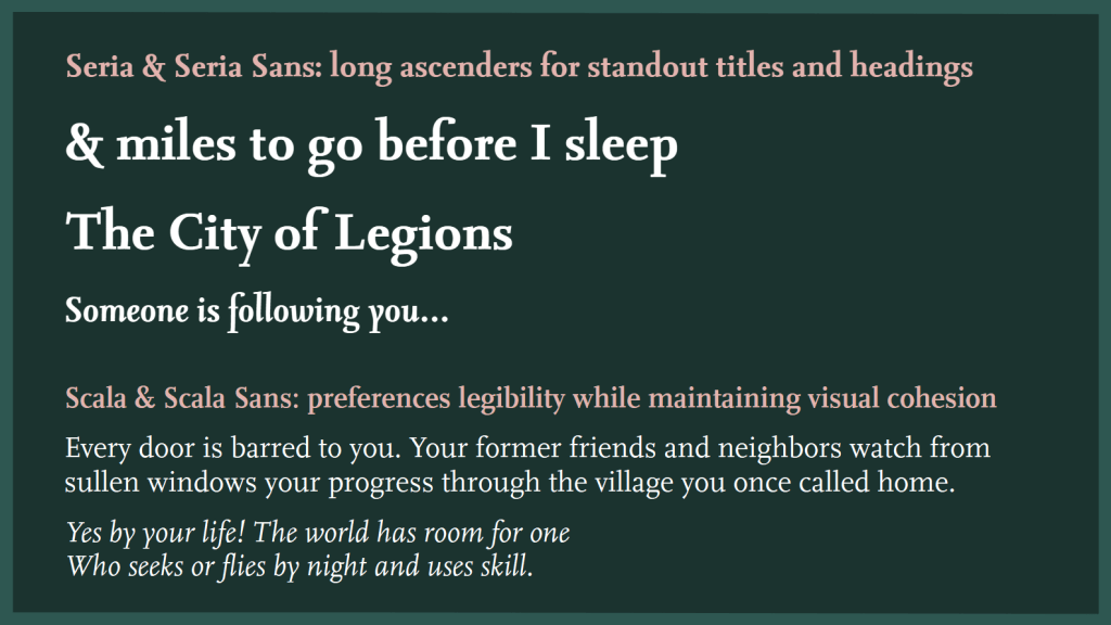
Stylizing the title without capitals maximizes the visual distinction of the long ascenders, giving it a handsome amount of contrast.
Copy & Content
Since this was a solo project, I wrote the game and all copy myself.
The location the player begins the game at is where my family’s cottage Nantllwyngwedd used to stand before it was abandoned near the beginning of the 19th century. Many of the images in the magazine are photographs taken by my family during our trips to Wales, including photos of the ruins of Nantllwyngwedd itself.
The story of the game is loosely inspired by Welsh fairy tales, the first branch of the Mabinogi Pwyll pendefig Dyfed, and the poetry of Taliesin.
This work is highly referential to older works of literature, and I wanted that to be a highlight of the work. So I worked quotes from the works it references into the text itself and included an end note section to the magazine with the sources of these quotes. This invites the reader to engage not only with the work, but also with the works it references.
Reflection & Takeaways
I had never taken on a project of this scale solo before and I deeply missed having a team of other designers. But having to do everything myself prevented me from specializing in the parts of the design process I am best at, which made me grow as a designer and show off skills in my toolbox I rarely get to take out.
